At lunch today I threw two large color swatches up on the wall in the bedroom from the colors we picked up at OSH yesterday. Unfortunately when I tried to photograph them with my iPhone the colors did not come out true to life at all. In fact the color is so messed up that I have no idea what happened. In these photos it looks like my foyer is blue. It's a sandy color called Egypt from Ralph Lauren - decidedly not blue. Also, my woodwork was showing up as pink. I've tried to lighten and tweak these in photoshop to best represent what is happening with these colors but I think I'm going to have to break out the Nikon.
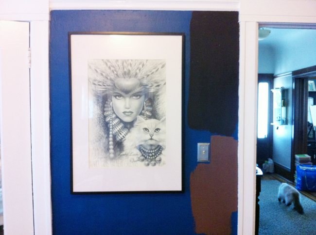
Bittersweet Chocolate is a really dark, rich color. It's almost a cross between deep brown and aubergine. I like it, theoretically, but I fear that it's reading too dark in the space.
French Press is lovely on the swatch from the store and in the can, but on the walls it reminds me a bit too much of Whoppers and I don't love it. Not at all.
So now I need to decide if we stick with Bittersweet Chocolate or go with a different color in the brown family. I'm sure Alan will have a very definitive opinion on the two colors that are currently up there that will shape how we move forward.

.JPG)
.jpg)