
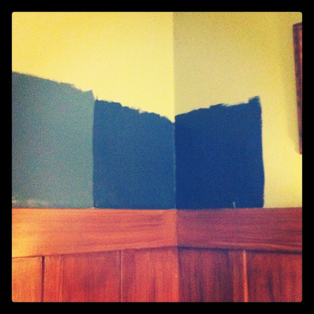
Yesterday at lunch I decided to paint bigger swatches to help us determine which of the two we liked best. Since this is the Behr paint with the primer mixed in I wasn't too worried about going over the darker colors, but with just the one coat on I can definitely see some of the underlying squares.
Among the two, the one on the left - Distance - seems like the better option, but there's still something about it that we're not completely sold on. The larger swatch definitely helped us to like it more than just the little square I had painted weeks ago, but we're still waffling about it. Alan thinks he'd like something lighter and more gray, so I'm going to investigate those options. It could work, but I'm not sold on that idea either. The whole point was to go with a rich, saturated navy in this room. Lighter and gray is a complete departure from that plan. But the deep, rich, saturated blue of Midnight Dream is completely wrong too. It reads too Crayola in here. I wonder if it's because our wainscoting isn't white and all the rooms that I'm loving with navy paint have white trim? Hmm, must think on this some more. In the meantime Alan keeps asking me, "what's wrong with the green?" What's wrong is that you can't tell what color paint will ultimately look until you actually put it on the walls and our swatch read darker and grayer than this albeit lovely shade of mint.
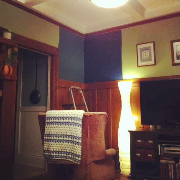
So, the hunt continues.
daaarker. You can get less saturated without losing the dramatic punch if you go darker. Dark and very saturated looks weird. Dark and greyer than you thought looks nice. Also, less saturation will fight less with your bright wood, I think.
ReplyDeleteWe had the exact same problem with our dark green office. The colors that looked nice on the cards looked very strange on the walls (like, um, fish-tank algae growing on the walls). We ended up going much less saturated than we had planned, and I've loved it for four years now.